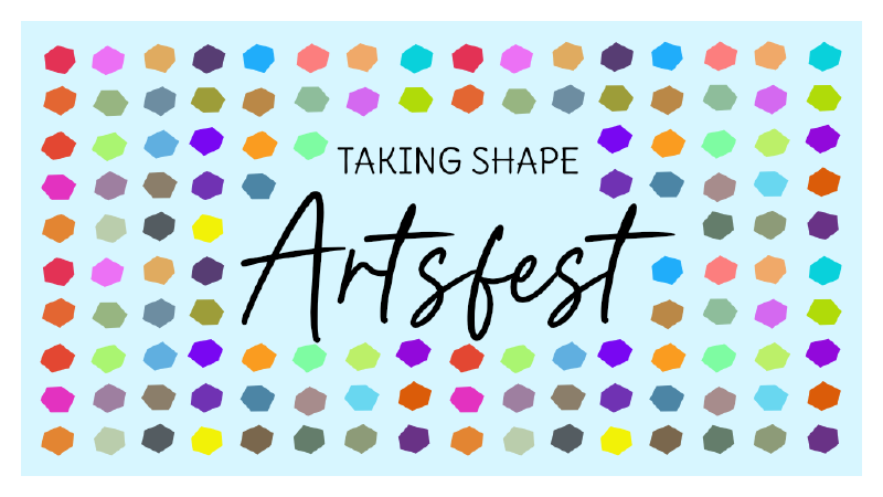
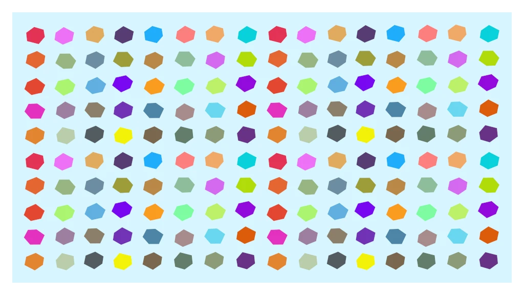
This year for Artsfest, I wanted to do something more simple. The last 2 years, Artfest was very much oriented towards traditional, painted artwork. To balance this, I also wanted a sort of color language but also showcase the variety of color.
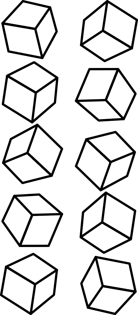
Originally, I decided to draw cubes. It was difficult to work the color in without the cubes being hard to identify, especially if each cube was a different color. Considering these were going to be pretty small to not be distracting, back to the drawing board.
Eventually, I settled on transforming the cubes in hexagons. They retain the same shape, but the look in much simpler and easier to recolor in bulk. Since I originally created 10 cubes, I duplicated the multi-colored hexagons to fill the space.
Finally, I started deleting squares to make space for the main text. To retain a bit of the feel of previous years, instead doing a paint brush, I used Queen Smoothie, a font closer to a felt-tip pen. The subheading uses the Google font Delius to keep the sense of playfulness, but not to discriminate against students who can’t read cursive yet.
There’s a hidden bit of symmetry in the original image, but removing the dots breaks that symmetry and also makes the original pattern harder to notice.
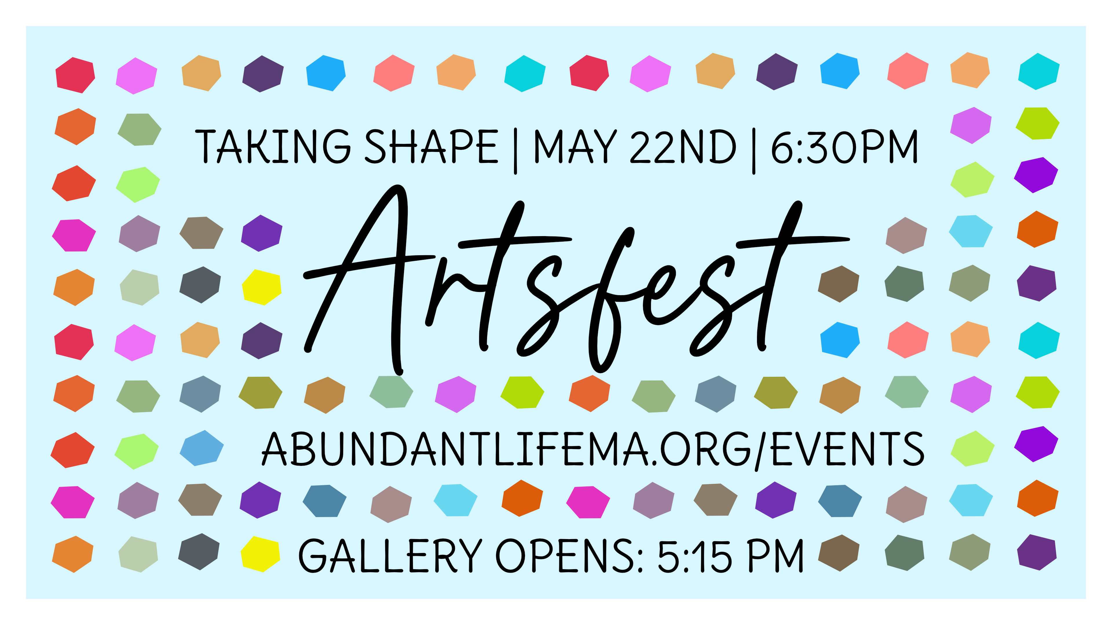
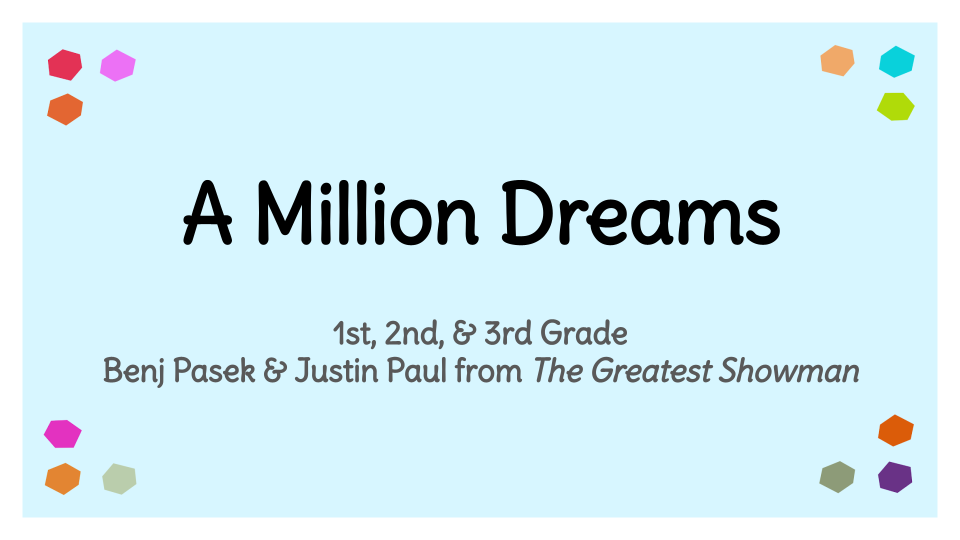
The simplicity of the dots also allowed for a lot of great adaptability. The dots became a decorative piece for slides with title slides, making the title slides and also helped serve a part on the front cover.